Graphic Design

I have worked for over 17 years in the commercial printing industry, designing and prepressing a large variety of materials, including newspapers, magazines, branding, packaging, and digital media. In addition, I have worked in a corporate
setting as an in-house designer and brand manager, collaborating with C-Level executives to create internal and external design and marketing campaigns.


Lion Coffee Packaging Redesign: Bringing the Spirit of Hawaii to the West Coast

Project Goals & Objectives:
The goal of this project was to refresh the Lion Coffee packaging design for its West Coast commercialization while adhering to established brand standards. The primary objective was to effectively convey that Lion Coffee is a locally rooted product, offering island-inspired coffee flavors that transport consumers to a “Hawaii experience” from the comfort of their homes.

To achieve this, I incorporated a custom Kapa pattern, which I illustrated based on traditional Hawaiian design elements. This pattern adds authenticity and a sense of place, perfectly complementing the classic Lion Coffee branding staples, such as the iconic Lion’s head logo and signature PMS colors. These elements work together to maintain brand consistency while infusing the packaging with a distinctly Hawaiian aesthetic.

One of the challenges of this project was ensuring the design stayed within a 10-color separation limit, required for rotogravure printing. Balancing this constraint while delivering a vibrant and culturally resonant package design was key to successfully achieving the project objectives. Ultimately, the updated packaging strikes a harmonious balance between brand tradition and the exotic allure of Hawaii, enticing West Coast coffee lovers to indulge in a little island escapism with every brew.

Snohomish Farmers Market Poster Design Contest Winner

This vibrant poster was created to celebrate and promote the Snohomish Farmers Market, showcasing its lively and abundant spirit. The design features original illustrations of fresh, painterly vegetables, fruits, and flowers, each rendered in bold, vivid colors with rich textures. The hand-painted style brings a dynamic energy to the composition, capturing the essence of the market's diverse offerings.

Set against a dark background, the colorful produce and blooms pop dramatically, drawing the viewer’s eye and creating a sense of depth. The textured brushstrokes add a tactile quality to the artwork, evoking the organic and homegrown nature of the market. This bold, eye-catching design perfectly reflects the vibrancy and community-focused atmosphere of the Snohomish Farmers Market.

Snohomish School District Annual Report (2023-2024)

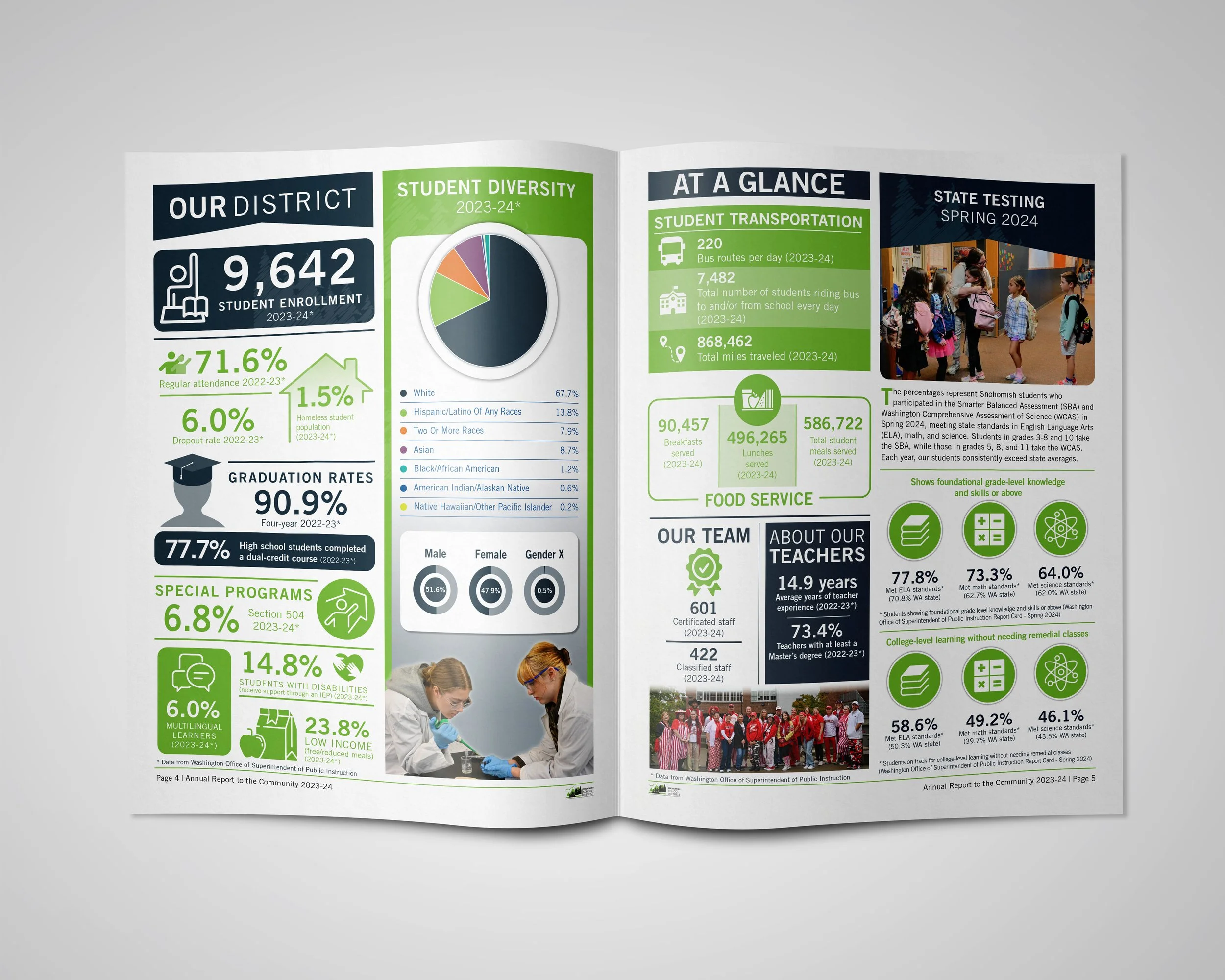
This project showcases the design of the Snohomish School District’s Annual Report for the 2023-2024 academic year. The report highlights key statistics and achievements, including student diversity, graduation rates, attendance, and state testing performance. It also provides insights into district operations such as transportation, food services, and special programs.

The layout combines clean, modern typography with vibrant visuals to ensure readability and engagement. Infographics and data visualization were used to present complex information in a user-friendly format. The cover and interior designs reflect the district’s commitment to excellence and community engagement, featuring real students and staff in dynamic, positive settings.

This project exemplifies strategic communication design tailored to inform and inspire a diverse audience, reinforcing the district's dedication to transparency and community connection

Innovative Camera Box Design
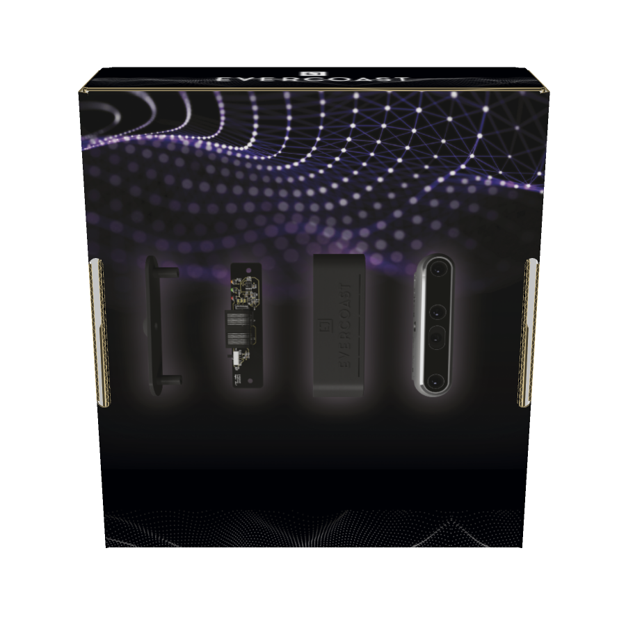
This project aimed to develop a sleek, user-friendly camera box for a tech startup specializing in advanced 3D imaging technology. Designed to house state-of-the-art 3D capture equipment, the box combines functionality with a modern aesthetic to meet the needs of professionals in the imaging field.

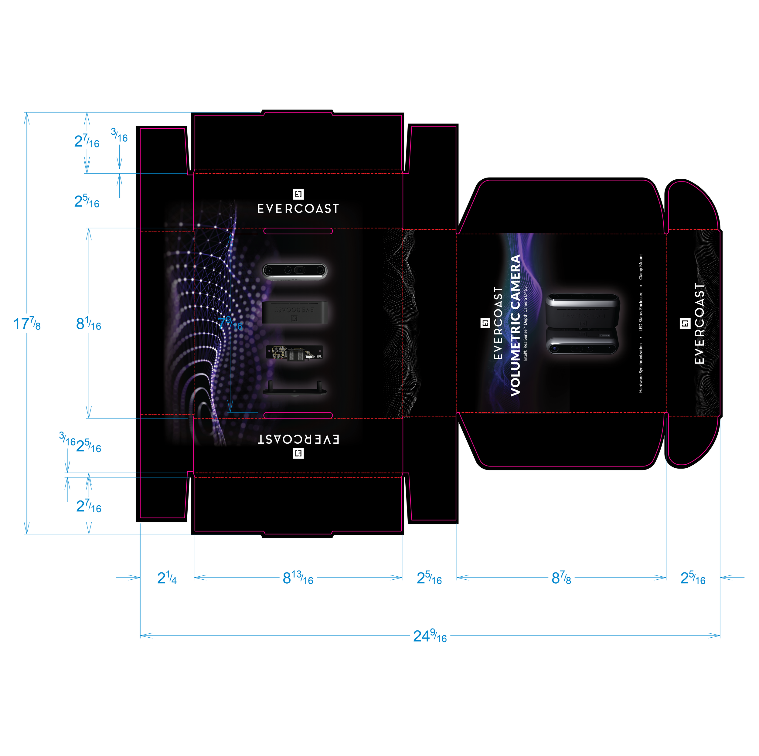
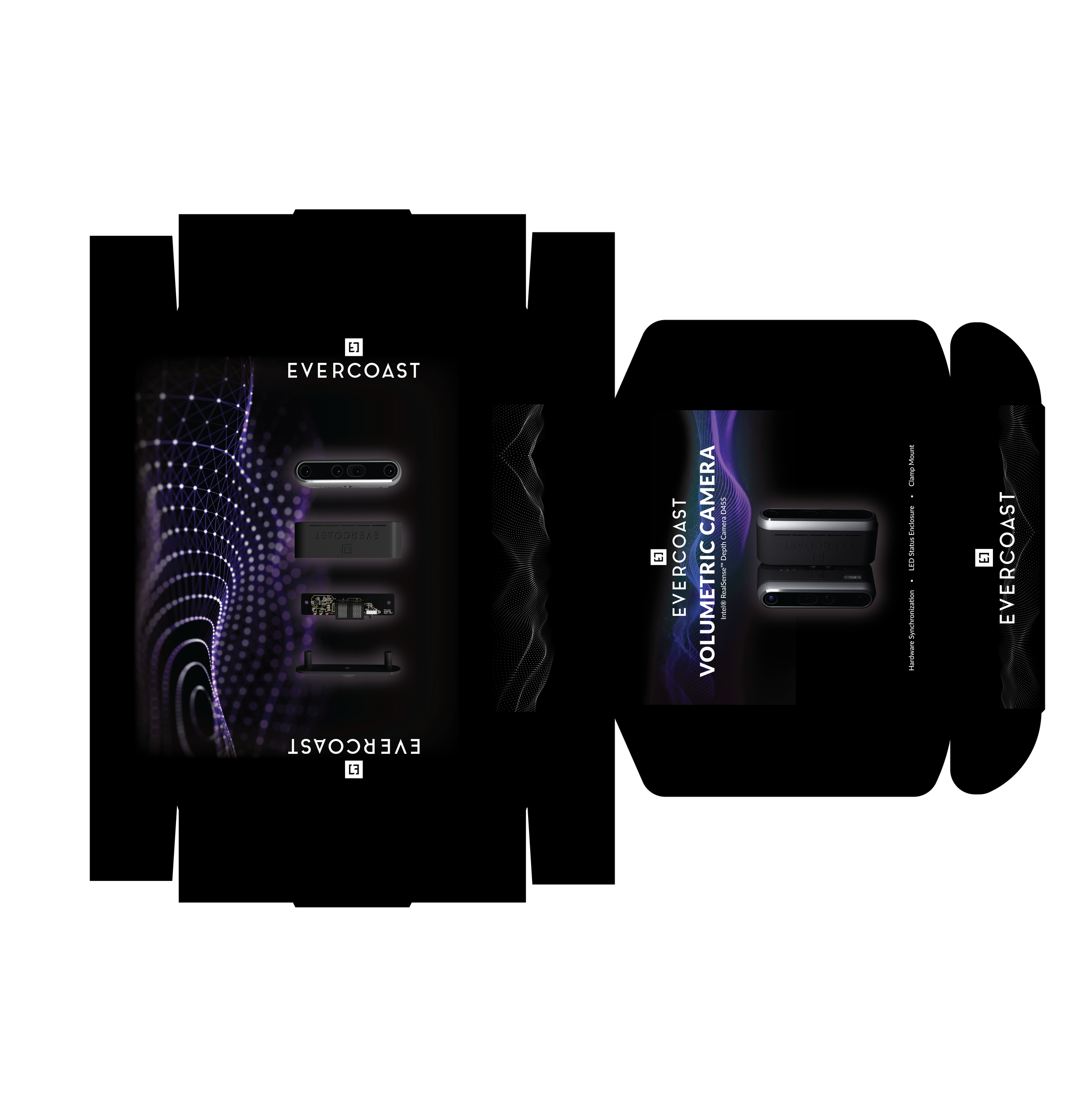
The design features a matte black finish, emphasizing a sophisticated and tech-forward look. Renderings of the camera equipment are integrated into the exterior, complemented by dynamic volumetric lines that convey precision and depth—an homage to the cutting-edge technology inside.

Beyond aesthetics, the box was engineered for maximum portability and durability. It includes custom foam inserts to securely hold the gear, ergonomic handles for easy transport, and weatherproof seals to protect the equipment from the elements. The result is a high-performance, visually striking camera box that embodies both innovation and practicality.

Bottom/Back of box design featuring an expanded rendering of the product.

Box design with dieline detail.

Fair Trade USA Brochure for Cascade Coffee

This brochure was designed to educate consumers and stakeholders about Cascade Coffee’s partnership with Fair Trade USA. The piece emphasizes the social, economic, and environmental benefits of Fair Trade Certified coffee, showcasing Cascade Coffee's commitment to ethical sourcing and sustainable practices.

The layout features engaging imagery of coffee farmers alongside impactful data visualizations and statistics, such as consumer loyalty metrics and purchasing highlights. Key sections outline the tangible benefits of Fair Trade, including improved working conditions, community development, and environmental stewardship.

This design balances informative content with visual appeal, creating a compelling narrative about the importance of supporting Fair Trade Certified products. It serves as both an educational tool and a reflection of Cascade Coffee’s values, aiming to inspire conscious consumerism and brand trust.

Seasonal Online Store Banners

Cascade Coffee Marketing Flyer

This marketing and sales flyer was designed for Cascade Coffee, the premier co-manufacturing facility on the West Coast. The piece consolidates their key attributes and services into an engaging, easy-to-read format. It highlights Cascade Coffee’s impressive manufacturing capabilities, including their production capacities and specialized line offerings, while also showcasing their commitment to sustainability and quality through a variety of certifications.

To ensure clarity and impact, the design incorporates bold headers and simple icons that emphasize key statistics and achievements, allowing potential clients to quickly grasp what sets Cascade Coffee apart. This thoughtfully crafted flyer effectively communicates the company’s strengths, positioning them as a leader in the coffee co-manufacturing industry.

Strategic Plan | Snohomish School District

This Strategic Plan for the Snohomish School District was designed to effectively communicate the district’s goals, achievements, and future initiatives. The layout integrates district PMS colors and adheres to strict branding guidelines, ensuring a cohesive and professional look. To add visual interest, the design features vibrant watercolor textures that bring a fresh and dynamic feel, paired with geometric shapes that frame photos and key data points.

Graphs and infographics were carefully styled to be both informative and visually appealing, making complex information easy to digest. The final piece balances functionality with creativity, serving as a compelling resource for stakeholders and the community.

This logo for Looking Glass Coffee, in Snohomish, Washington, draws inspiration from a vintage Alice in Wonderland theme, specifically Through the Looking Glass. It features an ornate, antique-style frame encircling the name, with bold, tilted typography that adds a whimsical yet sophisticated touch. The design captures a sense of nostalgia and fantasy, perfect for a cozy, imaginative coffee shop atmosphere. The collateral pieces include a special logo for their one-year anniversary, a custom die-cut gift card holder, and a custom gift card.

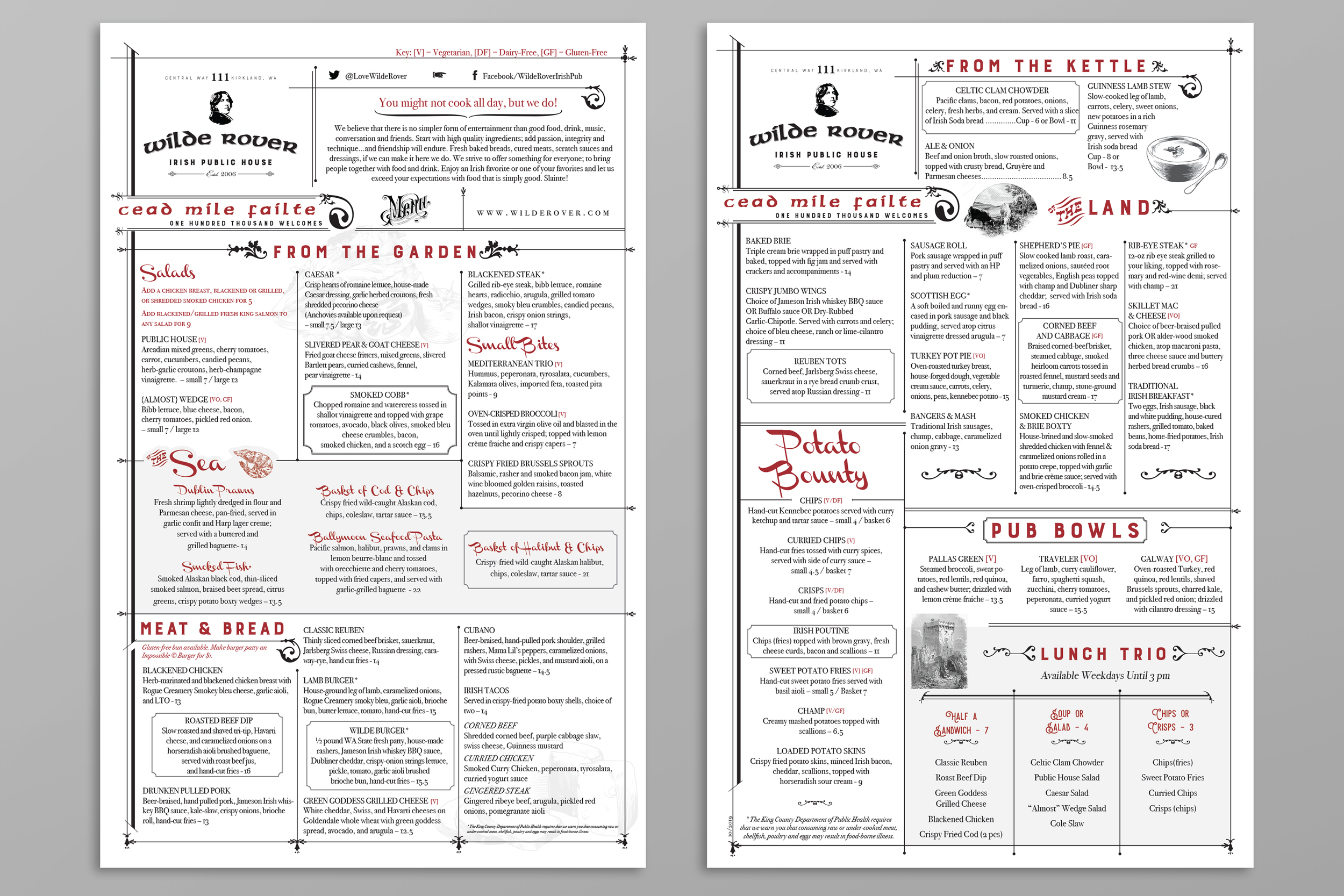
This menu design for Wilde Rover Irish Public House in Kirkland, Washington, blends traditional Irish charm with a clean, modern layout. The logo features a classic serif typeface alongside an illustrated profile of Irish poet and author, Oscar Wilde, evoking a sense of heritage and authenticity.

The menu itself uses ornate typography and decorative flourishes to highlight sections such as "From the Garden" and "Potato Bounty," while maintaining readability with clear hierarchy and spacing. Red accents are thoughtfully used to draw attention to key items, adding visual interest without overwhelming the design. Celtic-inspired motifs and a welcoming Irish phrase, "Cead Mile Failte" ("One Hundred Thousand Welcomes"), enhance the pub’s warm, inviting atmosphere.

This PowerPoint deck was developed in collaboration with Cascade Coffee's Innovation department to elevate their interactive training course, Coffee 101: Coffee Harvest. I crafted vibrant, custom illustrations of coffee plants, beans, and origin maps, blending them seamlessly with a polished and engaging layout. The presentation balances educational content with visual appeal, providing an immersive learning experience that captures the essence of coffee production and sensory exploration. This design highlights my ability to combine detailed illustration with functional design for a professional and captivating result.

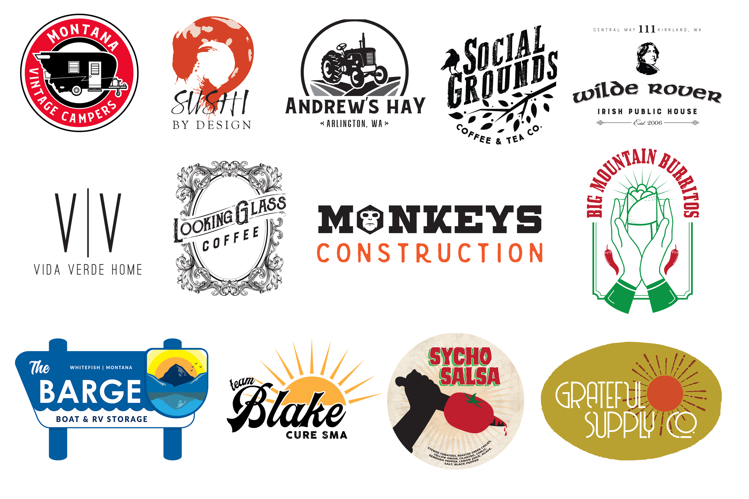
This collection of logos showcases a wide range of design styles tailored to different brands and industries. From vintage-inspired designs, like the retro camper for Montana Vintage Campers and the ornate frame of Looking Glass Coffee, to modern minimalism seen in Vida Verde Home, each logo reflects its unique brand identity. Several logos evoke a sense of community and nature, such as Social Grounds Coffee & Tea Co. and Grateful Supply Co., while others like Monkeys Construction and Sycho Salsa add playful, bold elements. Themes vary from the rustic, down-to-earth feel of Andrew's Hay to the vibrant, fresh appeal of Big Mountain Burritos. Overall, this assortment highlights versatility in style, capturing each brand's essence with clean, memorable visuals.

This project, created for a leadership team, transforms a standard goals document into an engaging, visually appealing piece by incorporating an explorer theme. Inspired by the company’s reputation as "explorers" in their industry, I used this concept to design custom icons and graphics for each department, capturing a sense of adventure and discovery. Each department is represented by an illustrated icon, such as a compass, hiking boots, or a map, all drawn in Procreate to give the visuals a hand-crafted, approachable feel. These illustrations are complemented by a woodgrain background, reminiscent of topographic maps, which subtly unifies the piece and adds to the outdoorsy aesthetic.

The final layout includes clear sections for each department, with specific goals and objectives presented in an easy-to-read format that keeps the viewer's attention. Playful but professional, this piece replaces the standard Word document, adding a fresh, memorable touch to routine goal-setting. This design brings a sense of excitement and purpose, making departmental goals more inspiring and accessible for team members. It’s a creative, on-brand solution that aligns with the adventurous spirit of the company while keeping functionality at the forefront.

Cookin' with Cascade
Company Cookbook Design

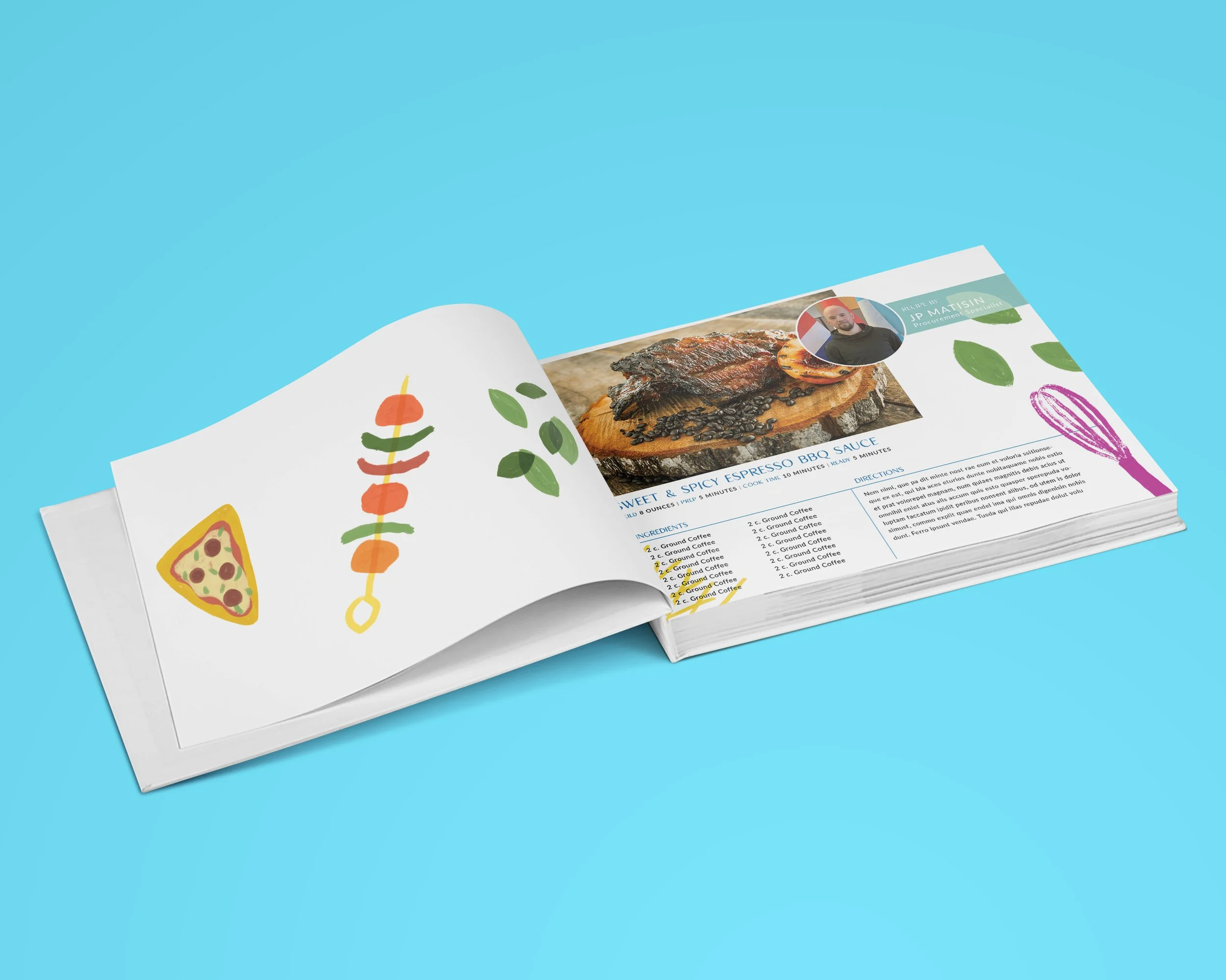
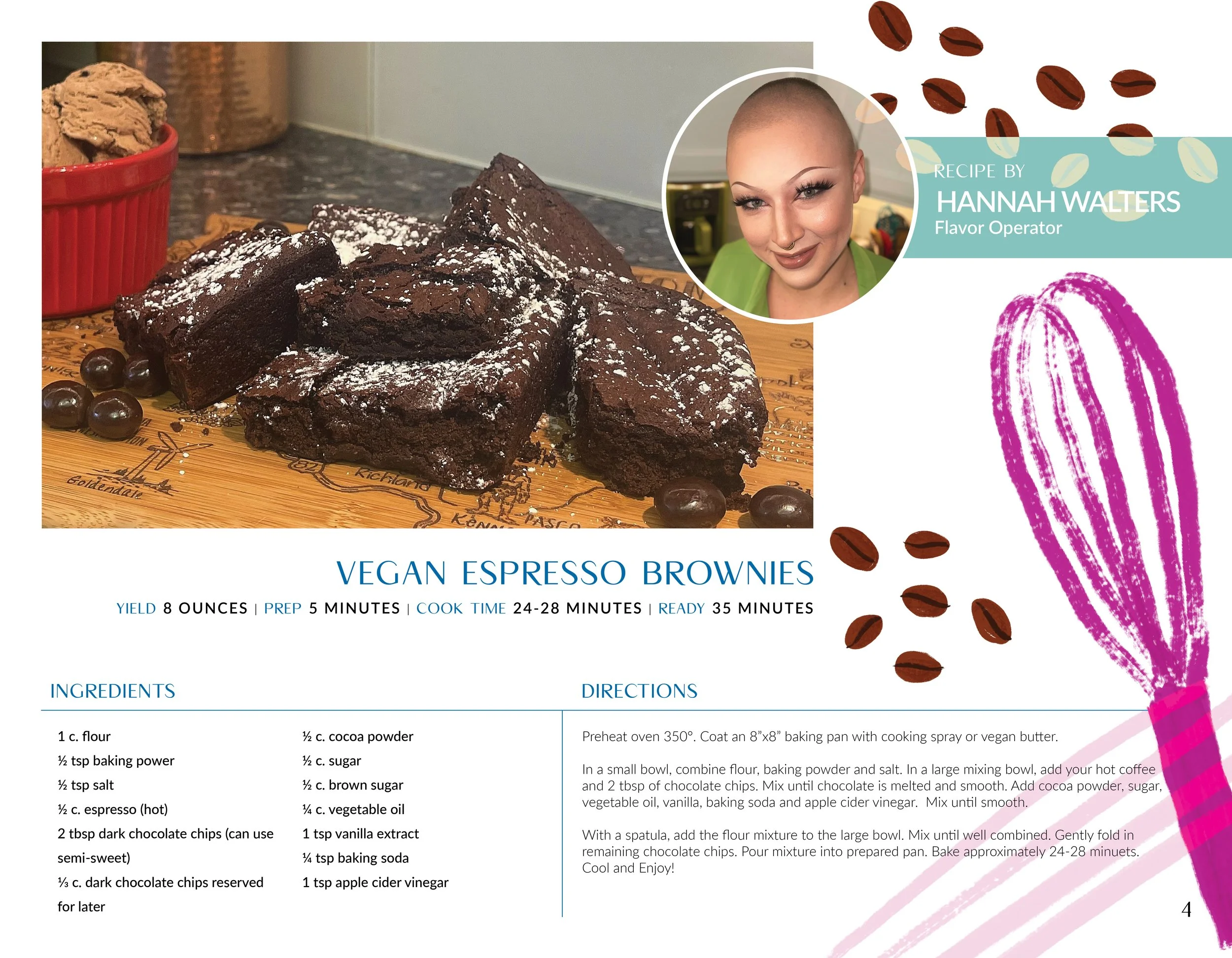
This vibrant, custom cookbook was designed for Cascade Coffee’s holiday gift initiative. Every employee contributed a unique recipe featuring coffee as a key ingredient. I handled the layout in Adobe InDesign and brought it to life with colorful, hand-drawn food illustrations in Procreate, giving the book a playful and engaging feel. The final product was a professionally hard-bound book, perfectly blending creativity and company culture. It’s a dynamic showcase of collaborative storytelling through food and design, and I’m thrilled with how it turned out—it’s truly a standout piece in my portfolio!


A peek at the process.

Creating illustrations of any kind is my happy place, but drawing FOOD is the sunniest corner of my happy place! This little video is a time-lapse of the food illustrations I made for this custom cookbook.
 
 
Next
Next

Illustration